Choosing the right "Face" for your chatbot
Zoek je een gezicht voor je chatbot? Ontdek hoe logo's, avatars of foto's de gebruikerservaring kunnen bepalen.

Chatbots have become a crucial tool for businesses and organisations to engage with their audiences. A critical aspect of deploying a chatbot is deciding how it will be visually represented. This decision can significantly impact user experience and brand perception. Let’s assume you have a chatbot that works with texts, what face should you give it?
There is a not an authoritative answer but based on experience I will give guidelines that can help you decide. Let's explore the three most common options: using a logo, an avatar, or a photo, and understand their implications for your chatbot strategy.
1. The Professional Appeal of Logos
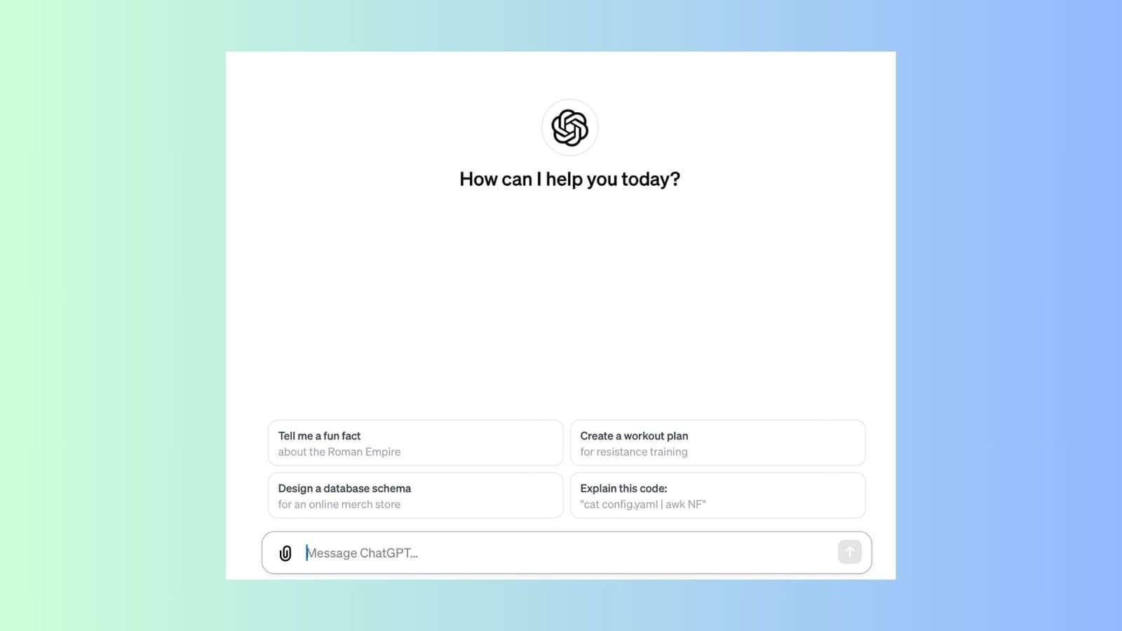
Using a logo as the face of your chatbot is a classic choice that exudes professionalism and consistency. It's ideal for businesses that prioritize brand recognition and want to maintain a formal tone in their customer interactions.
Best for: Corporate sectors, professional services, and B2B interactions.
Pros: Enhances brand recognition, instills trust, and maintains a professional image.
Cons: May lack the personal touch that encourages user engagement.

2. Avatars: Personalization at Its Best
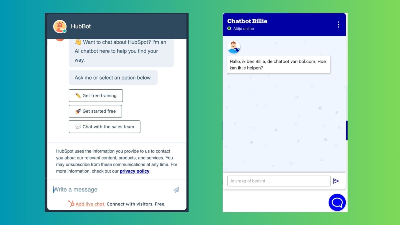
Avatars, whether in the form of characters or stylized symbols, offer a unique way to personalize the chatbot experience. They can reflect your brand's personality, making interactions more engaging and relatable.
Best for: Creative industries, consumer-focused services, and younger demographics.
Pros: Creates an engaging, personable experience; can embody brand personality.
Cons: Requires careful design to align with brand identity and audience expectations.

3. Photos: The Human Touch
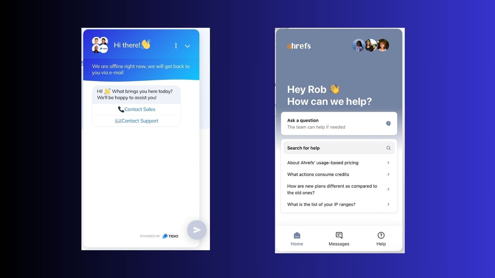
Using a photo, particularly of a person, humanizes the chatbot experience. This approach can be especially effective if your brand values personal connection or if the chatbot handles complex, empathetic interactions.
Best for: Healthcare, hospitality, and customer support where empathy and personal connection are key.
Pros: Offers a humanized interaction, builds empathy, and enhances relatability.
Cons: Can set unrealistic expectations about the human involvement in the chat service.

As you ponder over the right visual choice for your chatbot – be it a logo, avatar, or photo – remember that this decision is pivotal in how your audience interacts with and perceives your brand. It's essential to deeply understand your audience, align the choice with your brand’s identity, and consider the nature of interactions your chatbot will handle. Don’t hesitate to experiment; create mockups, engage in A/B testing, and gather feedback. This is not just about choosing a visual; it's about crafting an experience that resonates with your users.
And if you find yourself at a crossroads, seeking professional advice can provide clarity and direction. Ultimately, the choice you make should not only look good but should also be a strategic fit for your brand, enhancing the chatbot’s role as an engaging and effective communication tool. Remember, your chatbot’s face is more than just an image; it's the first impression, the ongoing interaction, and potentially, a lasting memory in the minds of your users.
This article was originally published in Dutch on Chat voor Bedrijven.


